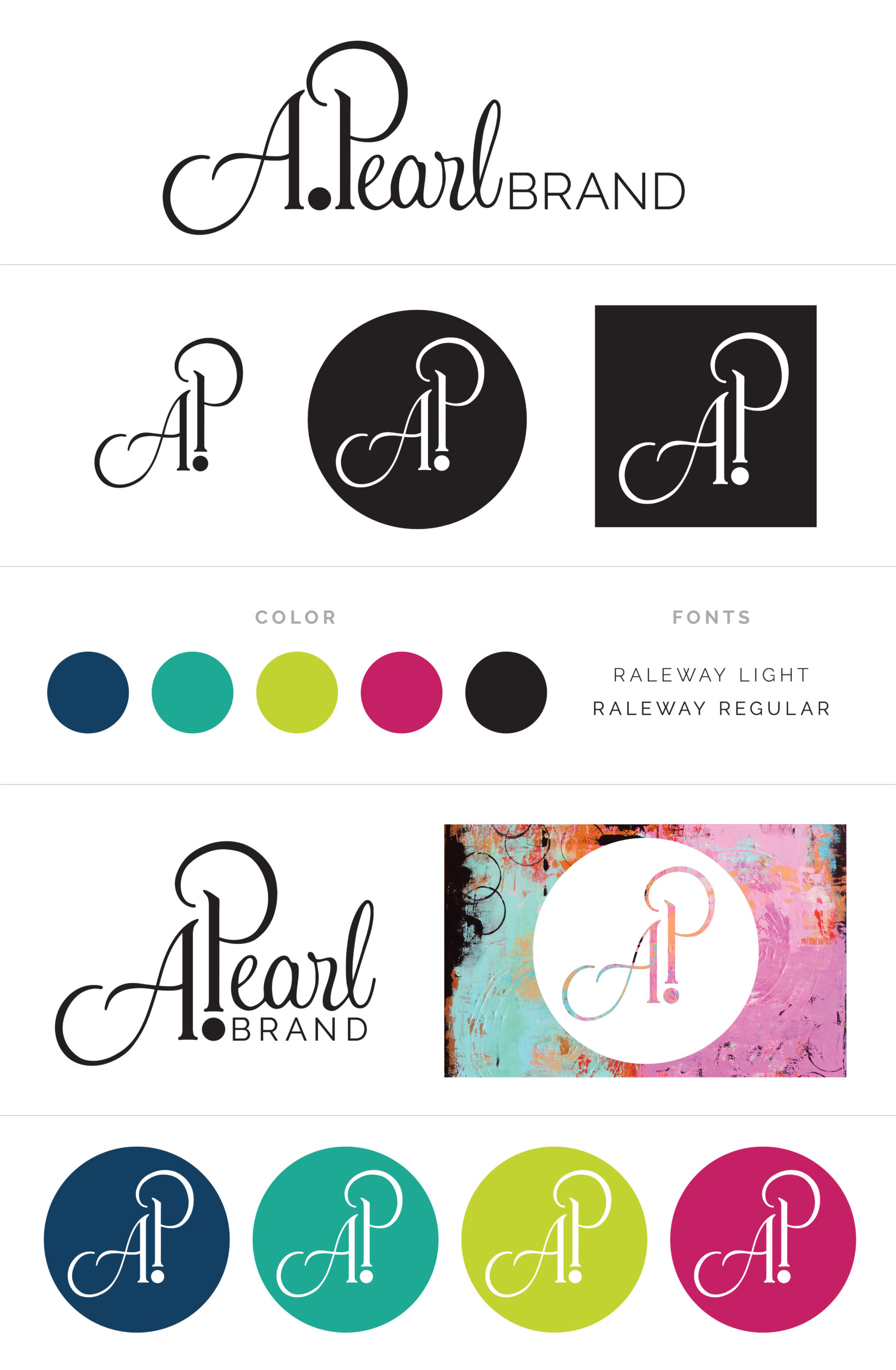
Logo design and initial brand guidelines for a marketing agency dedicated to reviving brands, launching products, and developing marketing strategy. The company name was a play on the client’s name, I incorporated a pearl in the design in the brandmark as an easy identifier on social media channels.
Logo sketch
After several iterations of sketches and type studies, the designs were tweaked and narrowed down to the sketches below. I wanted the client to have a brandmark, vertical version, and horizontal version of the logo to use on a variety of channels.
Logo and branding guide
Logos were refined, a color palette, and typeface were selected to pair with the logo.
Business cards
The business cards were designed with a raised texture on the front to mimic pearls. Classic, black and white colors to create a striking look.
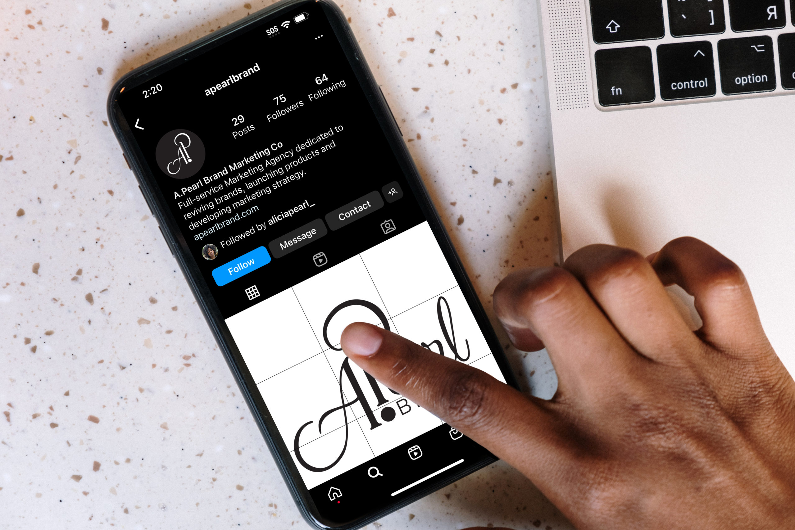
Brandmark and social media
Many brands on social media shrink their full-size logo down to the small circle on Instagram, losing legibility. I wanted the client’s brandmark to stand out in the cluttered feed.